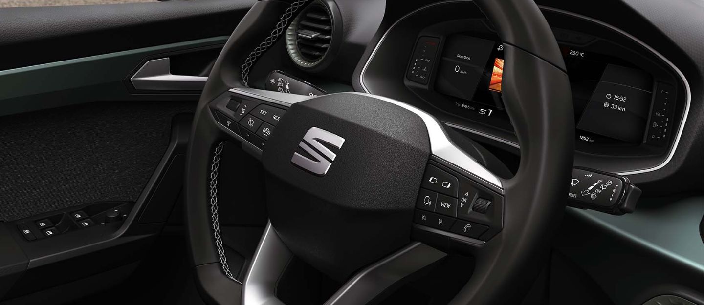
Sociedad Española de Automóviles de Turismo, commonly known as SEAT, started as Spain’s first car manufacturer in 1950. The brand played a pivotal role in the mobilisation of Spain by launching its first vehicle, SEAT 1400. Its debut model highlighted SEAT’s dedication to quality and affordability. Furthermore, over the years, the company has evolved into the world’s most design-conscious automaker.
SEAT was primarily a government initiative that gradually transformed into an integral part of the Volkswagen Group. Despite such significant transformations, the brand preserved its distinctive identity, reflecting its rich legacy. Moreover, with SEAT’s growth in the automotive industry, its visual identity also saw several modifications. Let’s explore the history of the SEAT logo, which highlights the evolution of the brand’s identity over the decades.
History of SEAT Logo
SEAT, one of the Volkswagen Group-owned brands, came into being as a result of the joint venture between Instituto Nacional de Industria (INI), Spanish private banks and Fiat. The brand achieved ample milestones since its inception in 1950.
The continuous progress and innovations also impacted SEAT’s visual identity. Its visual identity history can be divided into two distinct phases.
The first phase began in 1953 and was strongly influenced by Fiat. On the other hand, the second phase, called ‘the modern era,’ started in 1982, focusing on the brand’s individuality. Here’s the SEAT logo evolution timeline to help you understand the different logos of the brand and their meaning.
The Ornate Start (1953 – 1960)
SEAT got its first logo in 1953. The debut logo came with an elaborate design. It featured a traditional crest with a red background enclosed in a dark grey frame. Furthermore, this logo had two grey wings on either side of the oval frame extending upwards.

The oval perimeter was divided into three parts by bold grey stripes. The uppermost part included the brand name ‘SEAT,’ and the lower one incorporated the phrase ‘Licencia Fiat.’
The Glossy Badge Era (1960 – 1962)
The founding logo lasted seven years and was followed by a new circular emblem. The updated logo featured a spherical frame with a glossy badge and the same red background. The glossy badge was wrapped in a broad silver rim with leaf details. The brand name was written in white, while the tagline was inscribed in silver colour.
Bold Monochrome Logotype (1962 – 1968)
The second logo of SEAT lasted just two years. In 1962, the brand introduced its updated logo, exhibiting a new appearance. This version of the SEAT logo was simplified and included just the brand name in thick font. This logo endured six years before the brand came up with an updated design.
The Minimalist Emblem (1968 – 1970)
The SEAT logo introduced in 1968 displayed its traditional red background and grey circular frame. The brand name was engraved in white colour in the centre on the red background. This logo did not include taglines or detailing, making it the first minimalist logo in SEAT’s history.
The Electric-Blue Logo (1970 – 1982)
In 1970, the brand’s logo showcased vibrant yellow lettering, marking a significant event in SEAT symbol history. Each letter of the brand’s name was placed in its own electric-blue square. This logo stayed active for an entire decade. The combination of design and colour in the 1970s logo exuded confidence, progress and vitality.
The Iconic ‘S’(1982 – 1990)
The year 1982 marked the beginning of a new identity for SEAT. To introduce their new identity, the brand brought forward their distinctive symbol. The logo design included a bold letter ‘S’ containing pointy blue and white diagonal bars. This logo represents speed, motion and advancement.
Solid Lines (1990 – 1999)
The logo introduced in 1990 was a slightly updated version of the last one. The diagonal bars were decreased. Four blue and three white bars were enlarged, which added elements of solidity and power to the badge.
Silver on Red (1999 – 2012)
The next logo, launched in 1999, showcased the silver-coloured letter ‘S’ with a red background. The stripes were reduced even more. Just two red stripes remained, simplifying the updated logo substantially. Furthermore, the brand name was mentioned below the badge in red, featuring a custom sans-serif style.
The Sharpened ‘S’ (2012 – 2017)
SEAT’s 2012 logo was a sharper and more precise version of the last one. The silver-coloured ‘S’ was cut in half by a white diagonal line. This three-dimensional logo came with a gradient silver finish and a red wordmark in a thinner typeface at the bottom.
The Modern Monochrome (2017 – Present)
The brand switched back to a monochrome palette in 2017 and it has not undergone any updates. A sleek black letter ‘S’ is positioned above the wordmark utilising a black sans-serif typeface on a white background. The current logo’s design is minimalist but exudes a strong sense of power and style.
FAQs
What are the origins of the SEAT car brand?
SEAT is a Spanish car manufacturing company founded in 1950 to facilitate the nation’s mobilisation.
Who is the CEO of SEAT?
The CEO of SEAT and CUPRA car brands is Wayne Griffiths.
Who makes SEAT engines?
Volkswagen Group supplies the powerful engines of SEAT cars.
SEAT logo history shows the brand’s visual and operational evolution since its beginning. The company started with traditional and elaborately decorated logos. However, the current logo of SEAT features a sleek and modern design that underscores its commitment to innovation. As SEAT moves forward in the auto industry, its logo will consistently reflect its heritage and future aspirations.
If you want to expand your car collection or switch to a new ride, go through these used SEAT cars for sale in the UAE. Moreover, you can go through these used cars for sale in the UAE if you want to limit your options.
Stay tuned to UAE’s leading auto blog to learn the history of different car brands’ logos.
Cover Image Credits: SEAT’s Official Website
Related Posts