A motorcycle logo is more than just a visual identifier — it’s a reflection of a brand’s legacy and design philosophy. Every badge carries decades of innovation, craftsmanship and brand evolution. Whether it’s the wing of freedom in Honda’s logo or the shield of resilience in Harley-Davidson’s, each emblem represents values that extend far beyond aesthetics.
Famous Motorcycle Brand Logos Explained
From bold emblems to sleek insignias, each motorcycle brand’s logo reflects its engineering precision and design philosophy. Let’s dive into some of the most iconic motorcycle logos and uncover their hidden meanings.
Honda
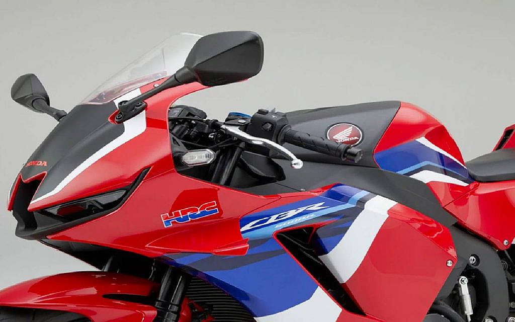
Honda’s motorcycle logo features a stylised wing, symbolising speed, freedom and innovation. The wing traces back to the company’s founder, Soichiro Honda, who was inspired by the Greek goddess Nike, representing victory. Over the years, the logo has evolved from intricate wing details to a minimalist, modern design that captures Honda’s commitment to progressive engineering and reliability. The ‘wing’ first appeared on Honda motorcycles in 1948 and has remained one of the most recognisable emblems in the motorcycle world.
Yamaha
Yamaha’s logo is a set of three tuning forks arranged in a circle. This originates from Yamaha’s roots as a musical instrument company. The three tuning forks symbolise the harmonious relationship between technology, production and sales—three pillars of Yamaha’s business. At the same time, they reflect the musical elements of melody, harmony and rhythm, which tie to the brand’s creative and innovative spirit.
Harley-Davidson
Few motorcycle insignia carry as much legacy as the Harley-Davidson Bar and Shield. Introduced in 1910, the motorbike logo features a bold shield symbolising strength and resilience, while the bar carries the Harley-Davidson name with pride. The black and orange colours evoke vibrance and energy, while the shield itself signifies protection and endurance. As for the interesting facts about Harley-Davidson, the brand also offers its logo-embedded merchandise for bike enthusiasts.
Ducati
One of the interesting facts about Ducati is that its first logo was quite simple — a white circle with a black outline featuring two crossed wires, a lightning bolt and the Latin inscription ‘Radio Brevetti Ducati’. Over time, the emblem evolved to reflect the brand’s racing spirit and engineering excellence. Today, Ducati’s logo features a sleek red shield with a distinctive curved white stripe. The colour red is symbolic of passion, energy and victory, while the overall design evokes prestige and aerodynamic precision.

Kawasaki

The Kawasaki logo, known as the ‘River Mark,’ is a stylised version of the Japanese character for ‘river’ (kawa). Originating in the 1870s on the flags of ships from the Kawasaki Tsukiji Shipyard, it symbolises the company’s heritage in engineering and its commitment to constant progress. The flowing lines represent innovation, resilience and the drive to move forward. In 2021, Kawasaki reintroduced the ‘River Mark’ as its unified global symbol, integrating its historic roots with a vision for the future, while the classic ‘K’ logo continues to appear on its motorcycles.
Kawasaki’s long-standing dedication to progress and performance has shaped its strong global reputation — discover more fascinating facts about Kawasaki here.
BMW Motorrad
BMW’s logo is instantly recognisable by its circular design and the blue and white quadrants taken from the Bavarian flag, symbolising the company’s heritage in Bavaria, Germany. Contrary to popular myth, the motorbike logo does not represent a spinning propeller but the company’s regional pride and dedication to craftsmanship. The circle from its precursor company remains, symbolising stability and precision engineering excellence.
Suzuki
For over six decades, Suzuki’s iconic ‘S’ emblem has symbolised reliability, energy and a proud Japanese heritage. Recently, Suzuki Motor Corporation unveiled a redesigned version of this emblem for the first time in 22 years. The update reflects the brand’s new corporate slogan, ‘By Your Side,’ representing its enduring focus on customers and forward-looking vision. While the signature ‘S’ outline remains, the emblem now features a flat, digital-friendly design with high-brightness silver paint. The new emblem made its debut at the Japan Mobility Show 2025, marking a new era for Suzuki’s identity.
Triumph
The Triumph logo features a bold typeface with a curved line connecting the ‘R’ to the ‘H’, representing a smile of satisfaction and pride. It reflects the brand’s British craftsmanship and the joy of the ride. The sleek and minimal design showcases Triumph’s evolution—from classic models to contemporary machines—while preserving its legacy of power and prestige.
KTM
KTM’s logo, with its sharp lettering and dynamic orange colour, embodies agility, intensity and endurance. Orange represents energy and excitement, qualities that resonate with KTM’s reputation for off-roading and racing excellence. The bold font conveys strength and fearlessness, traits every KTM rider identifies with.
Aprilia
Aprilia’s logo features clean typography on a red backdrop, symbolising energy and performance. The design’s simplicity contrasts with Aprilia’s deep racing heritage, where red reflects speed, emotion and determination. The modern style aligns with Aprilia’s innovative spirit and dedication to precision-engineered motorcycles.
Benelli
Benelli’s logo is a round emblem featuring a lion surrounded by laurel leaves. The lion represents strength and courage, while the laurel wreath symbolises victory and achievement.
The green colour in the motorcycle logo pays homage to Benelli’s Italian roots and the circular frame reflects unity and tradition.
FAQs
What are the most popular motorcycle logos in the world?
Some of the most recognisable motorcycle logos include Honda, Yamaha, Harley-Davidson, Ducati, Kawasaki, BMW Motorrad, Suzuki, Triumph, KTM, Aprilia and Benelli. These emblems are known globally for their strong visual identity and the heritage they represent.
What is the hidden meaning behind the Harley-Davidson logo?
The Harley-Davidson Bar and Shield symbolises freedom, strength and protection. The shield represents durability and reliability, while the bar embodies unity and the brand’s proud American identity.
Why does the Yamaha logo have three tuning forks?
The three tuning forks in Yamaha’s logo represent technology, production and sales, reflecting harmony between all areas of the brand. The design also honours Yamaha’s origin as a musical instrument manufacturer.
From Honda’s wings of freedom to Harley-Davidson’s timeless shield, each motorcycle logo tells a unique story of origin, passion and innovation. These motorcycle logos aren’t just designs—they’re reflections of the values, history and craftsmanship that define each brand.
The next time you spot one of these symbols on the road, remember that behind every logo lies a legacy of engineering excellence and dedication. Moreover, if these stories inspire you to own a piece of that legacy, explore a wide range of motorcycles for sale in the UAE on dubizzle.
Motorheads can also find a wide collection of sports motorbikes for sale in the UAE for an exhilarating riding experience.
Stay tuned to dubizzle’s auto blog to know more about automotive brands.
Cover Image Credits: Shutterstock Contributor | Terence Toh Chin Eng
Related Posts