- Compact Rooms Colour Significance
- Light and Bright Colours
- Dark Colours
- Nature-Inspired Colours
- Creating Depth
- FAQs
Choosing the right colour palette can completely change how a small room feels. Thoughtfully planned colour schemes for small spaces help interiors appear brighter, spacious and comfortable. While compact rooms can feel restrictive, the right colours reflect light, reduce visual clutter and create a sense of balance and calm. The key lies in choosing colours that create harmony throughout the room, making every element feel intentional rather than crowded.
Why Colour Matters in Compact Rooms
Colour influences how we perceive space and is one of the basic elements of interior design. Light and balanced tones reflect both natural and artificial light, making walls appear further apart. Darker shades can also work, but only when used strategically. Successful colour schemes for compact spaces focus on harmony, reflectivity and subtle contrast rather than bold saturation across every surface.
Light and Bright Colours That Open Up a Room
Light tones are the most reliable choice for compact interiors as they reflect light and reduce visual boundaries.
White and Off-White Tones
White remains one of the most effective small room colour ideas. It reflects the maximum amount of light and creates a clean and uncluttered backdrop. Off-white shades such as cream or ivory soften the effect while maintaining brightness. These tones work well in living rooms, kitchens and hallways where openness is essential.
Soft Pastels
Soft pastels like pale blue, blush pink and mint green introduce colour without making a room feel closed in. These shades create a calm atmosphere and are especially effective in bedrooms and bathrooms. As bright colour ideas for small rooms, pastels add personality while preserving a light and airy feel.

Light Neutrals
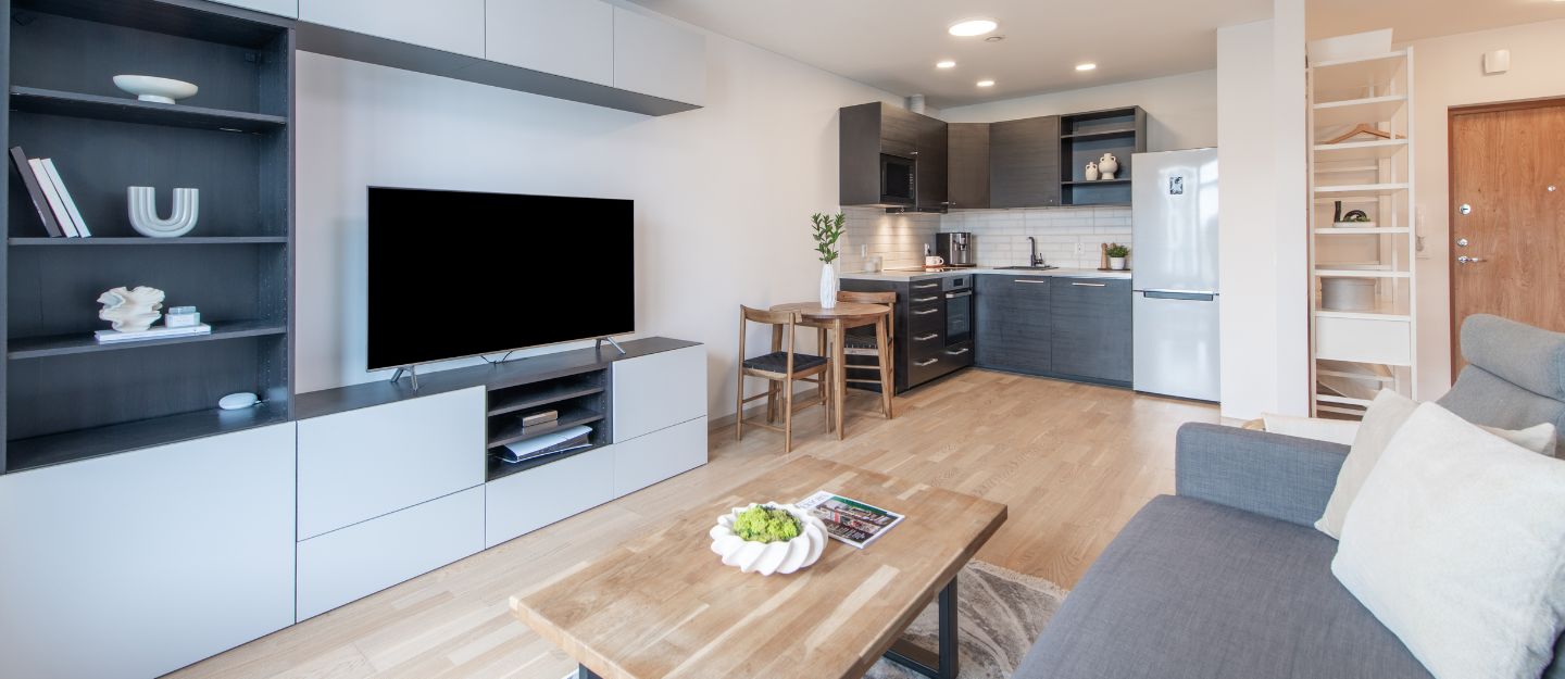
Beige, light grey and taupe are versatile choices that help make your room look bigger. They add warmth and depth while still keeping the space visually open. Taupe in particular is popular because it offers more character than white while still enhancing brightness. These shades suit living areas where comfort and elegance are equally important and provide a practical alternative to living room colours to avoid that can make the space feel cramped or heavy.
Using Dark Colours Without Shrinking the Space
Dark shades can work in small rooms when applied thoughtfully and in moderation. Used as accents or paired with lighter elements, they add depth and character without making the space feel enclosed.
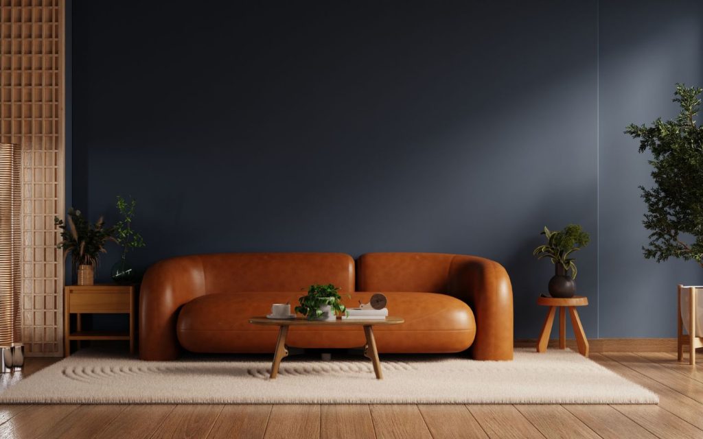
Dark Blue
Deep blue can add drama and sophistication. Using it on a single wall or pairing it with lighter surrounding colours helps maintain balance. This contrast draws attention away from room size and adds depth.
Charcoal and Dark Grey
Dark grey offers a modern and minimal appearance. When balanced with white trim, light furniture and good lighting, it can make a room feel refined rather than confined. These tones are effective as accent colours rather than dominant shades.
Nature-Inspired Colours That Expand Visual Space
Colours drawn from nature bring warmth and calm while maintaining a sense of openness. Soft greens, blues and earthy tones visually refresh compact rooms and create a relaxed, breathable atmosphere.
Pale Blue
Pale blue creates a fresh and calming environment. It reflects light gently and works particularly well in bedrooms and nurseries. When paired with white or light pink accents, it enhances the sense of openness.
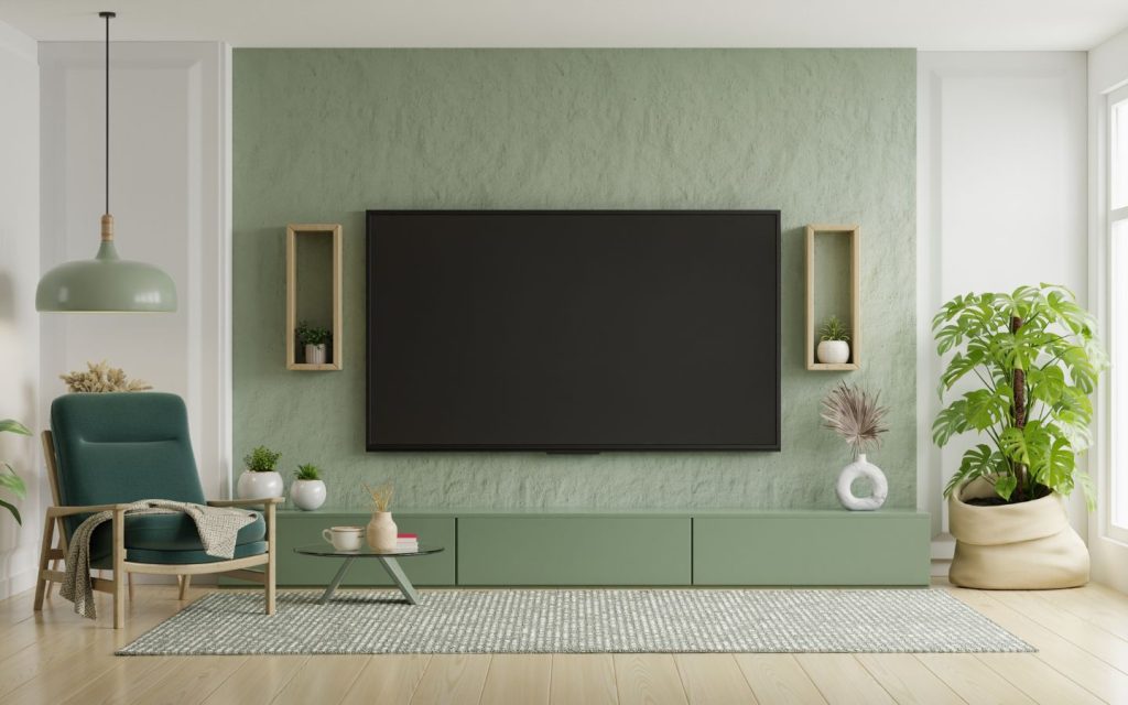
Sea Green and Light Green
Sea green and light green bring an earthy, refreshing quality to compact rooms. They pair well with wooden furniture and neutral décor. As part of colour schemes for compact spaces, these shades soften interiors and make them feel balanced and welcoming.
Earthy Ochre
Earthy ochre tones add warmth without heaviness. When sunlight enters the room, these colours appear brighter and more expansive. They are well-suited to rooms that receive good natural light.
Creating Depth with Accents and Contrast

While light colours form the foundation of a small room, well-placed accents add depth and visual interest without overwhelming the space. When used thoughtfully, contrast enhances structure and balance.
- Accent walls in slightly darker or richer tones can create a focal point while maintaining an open feel. These work best on naturally prominent walls, such as behind a bed or sofa.
- Contrasting trim and mouldings, particularly in white or off-white, help define architectural features and bring clarity to the room’s structure. This approach adds refinement without visual heaviness.
- Consistent colour flow between walls, ceilings and trim minimises visual breaks, allowing the eye to move freely and making the room appear taller and more cohesive.
FAQs
Which colour schemes make compact spaces look brighter?
Colour schemes that make compact spaces look brighter include light and balanced tones, soft pastels and light neutrals.
How do neutral tones help brighten small interiors?
Neutral tones help brighten small interiors by reflecting light, adding depth and maintaining a visually open and calm atmosphere.
Which accent colours work well in small spaces?
Accent colours that work well in small spaces include dark blue, charcoal, dark grey, earthy ochre and deeper pastel shades.
Small rooms can feel spacious and inviting with the right approach to colour. From off-whites and soft pastels to pale blues and taupe, well-planned small room colour ideas make a measurable difference. Balanced accents, light-reflective finishes and cohesive design choices all support effective colour schemes for compact spaces.
For those looking to create bright and airy interiors, there are ample properties for sale in the UAE that are designed with compact layouts that are ideal for experimenting with these colour schemes.
Keep reading dubizzle’s property blog to explore more expert tips on interior design and small space solutions.
